Mellow Harvest Dispensary: A Mellow New Look
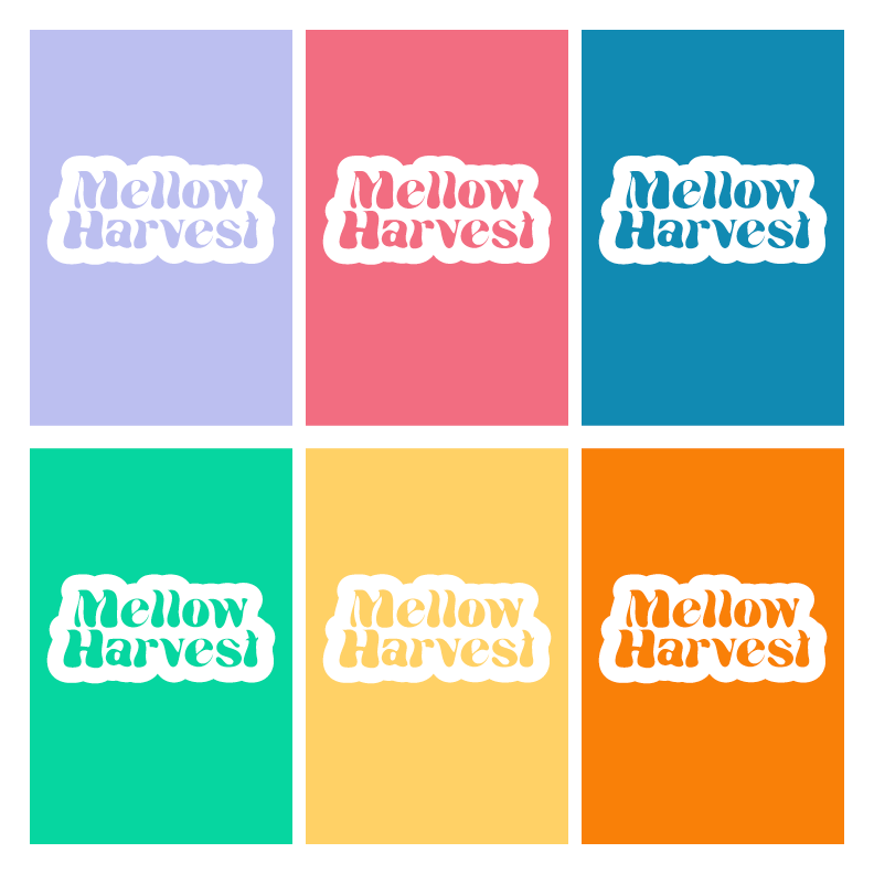
Southeast New Mexico's renowned cannabis dispensary, Mellow Harvest, is embracing a fresh and vibrant change with its newly rebranded logo. The team at PV Designs has ingeniously transformed the dispensary's original logo to embody a more soothing and mellow theme, beautifully infusing it with some delightful hippie vibes.
The reimagined logo perfectly captures the essence of a relaxed and serene ambiance that Mellow Harvest strives to provide to its valued customers. Inspired by the free-spirited era of the 1960s, the logo encapsulates the tranquil atmosphere and nostalgia associated with that peaceful time in history.
PV Designs, recognized for its innovative and bespoke designs, has skillfully crafted this revamped logo to resonate with Mellow Harvest's philosophy of natural healing and holistic wellness. The logo features vibrant earth tones and subtle transitions that symbolize the harmonious integration of nature and cannabis.
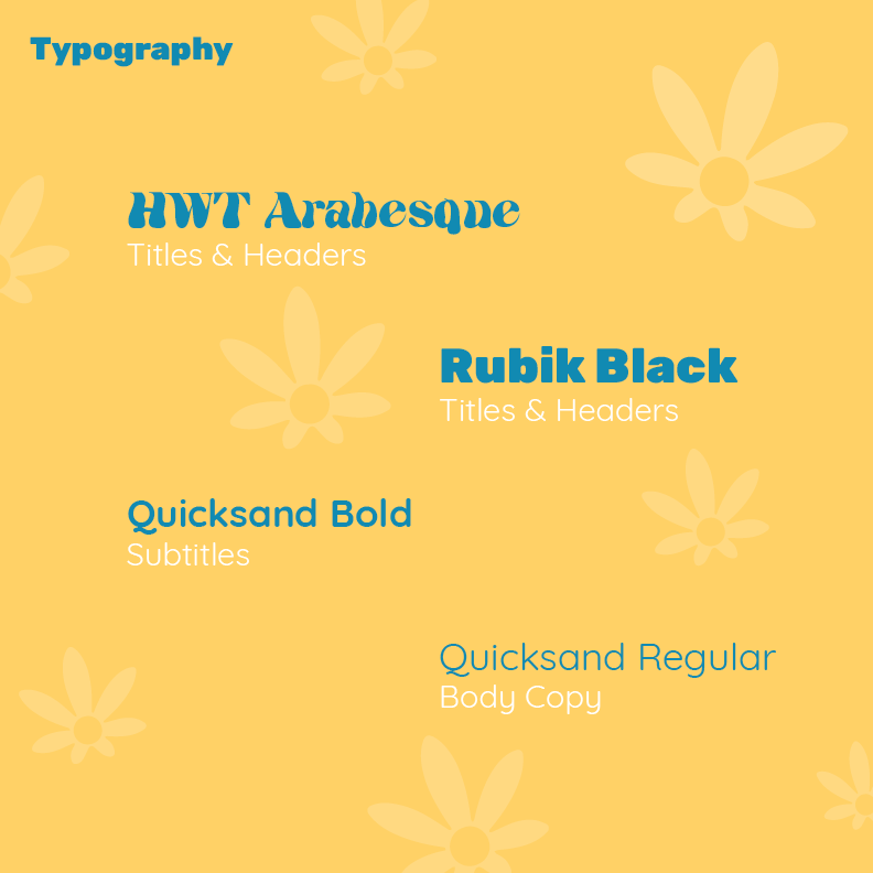
The typography conveys a sense of calmness, with the letters flowing effortlessly and evoking a feeling of tranquility. The choice of fonts emulates the gentle hand-lettering often seen in vintage posters and festival banners, further enhancing the hippie vibe of the logo.
As cannabis enthusiasts themselves, the team at PV Designs understands the importance of delivering a visually appealing brand identity. By creating this new logo for Mellow Harvest, they have successfully provided the dispensary with a unique and captivating visual representation of its ethos.
Mellow Harvest Dispensary invites you to embrace the mellow vibes of the past while embracing the healing properties of cannabis. Step into a world that celebrates peace, tranquility, and the simple joys of life.


